

|
 |
|
|---|---|---|
 |

|
|
 |
|
|
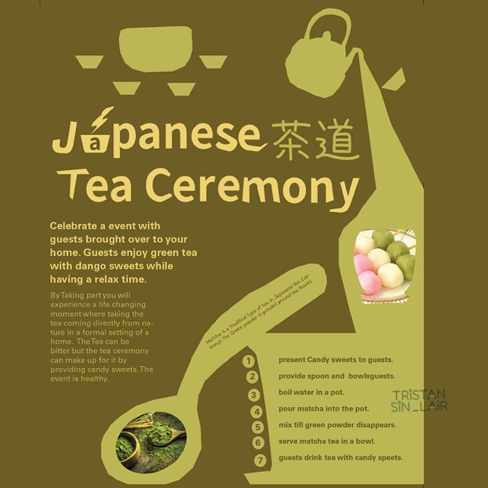
| This poster is made in Adobe indesign using color elements and image resources learned from a Japanese tea ceremony interview. The celebration is themed around mostly to drink tea. The brown background is based on the color of materials used in the preparation of tea making. the yellow color title is used to contrast from brown because it is a dark color. Then us- ing Nato Sans font to get the Kanji characters for Japanese tea ceremony. In The final stages of the poster design, using Adobe illustrator to make the typeface design to best match the theme, as well as include more green color towards the shape and font, because the type the tea used is more green tea. |  |
|---|
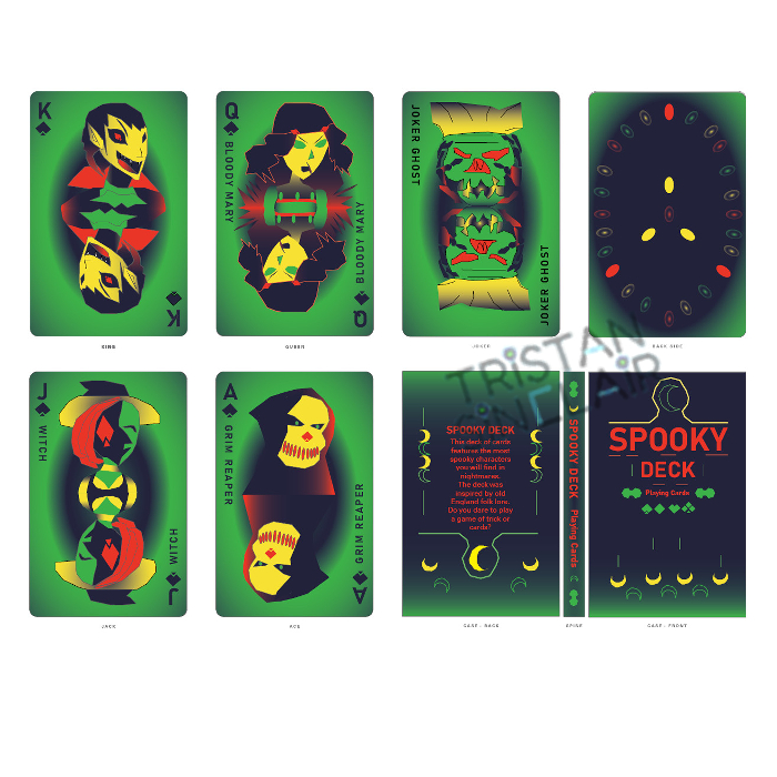
| This product design was made using Adobe indesign with the theme focus on making spooky playing cards. All characters in the deck are fantasy monsters. Vampire as king, Bloody Mary as queen, Ghost as joker, witch as jack, and grim reaper as ace. The deck is made with selective color choice to keep the spooky theme, color choices are red, green, yellow and black. |  |
|---|
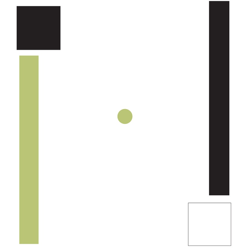
| This gif was made in Adobe indesign with only creating images using only shapes and only using green. In the gif using squares to construct a clock and show the clock hand moving frame by frame. Each frame are then imported into Adobe photoshop to create the gif using the timeline. | 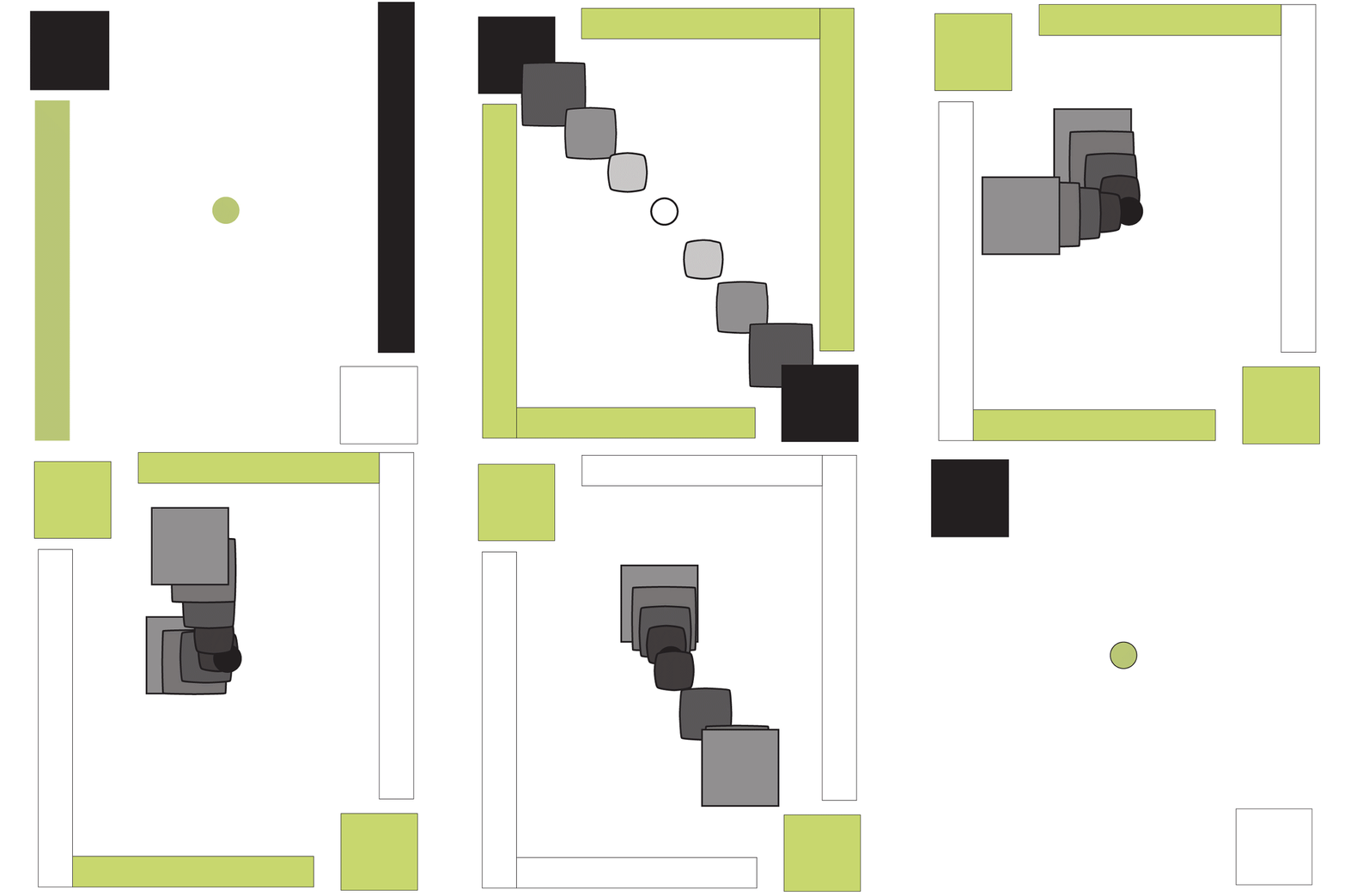 |
|---|
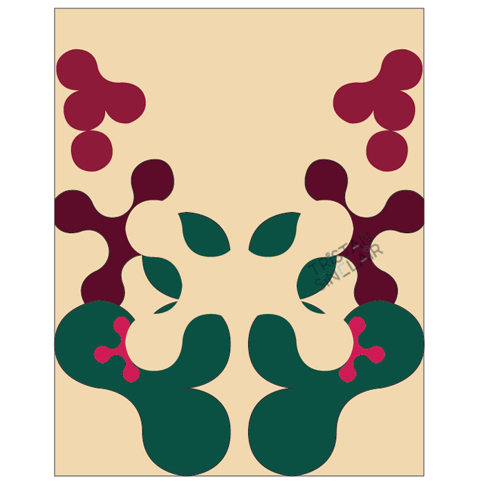
| This illustration was made in Adobe Illustrator to evoke emotion through color and symmetry pattern of shapes. Using green, yellow, and pink to create the theme of harmony. |  |
|---|
| In this illustration the using shapes and color to evoke the opposite of symmetry illustration, by using more darker colors as a base with minimum light. The making of this illustration is done using Adobe Illustrator. |  |
|---|
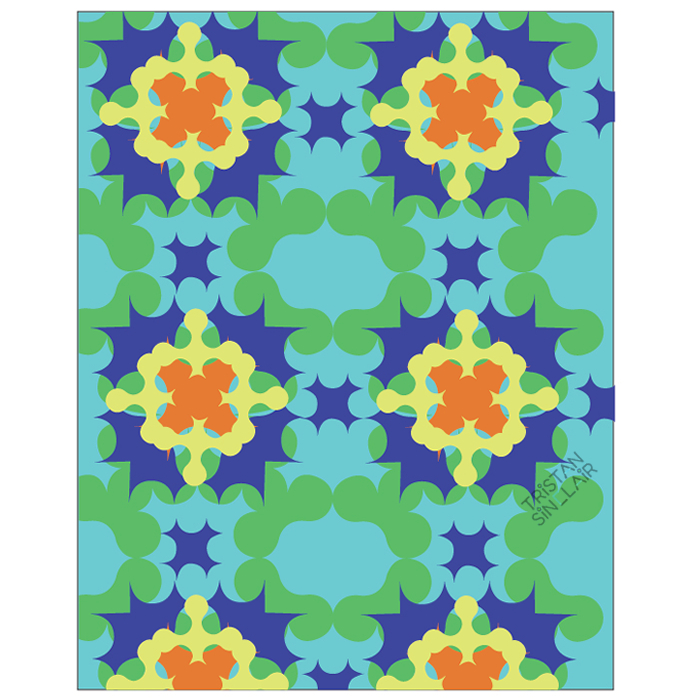
| The illustration is done in Adobe Illustrator. this illustration focus brighter evoke emotions by using a brighter tone of colors. the pattern of this art is repetition to make the art visual more dynamic with the shapes. |  |
|---|
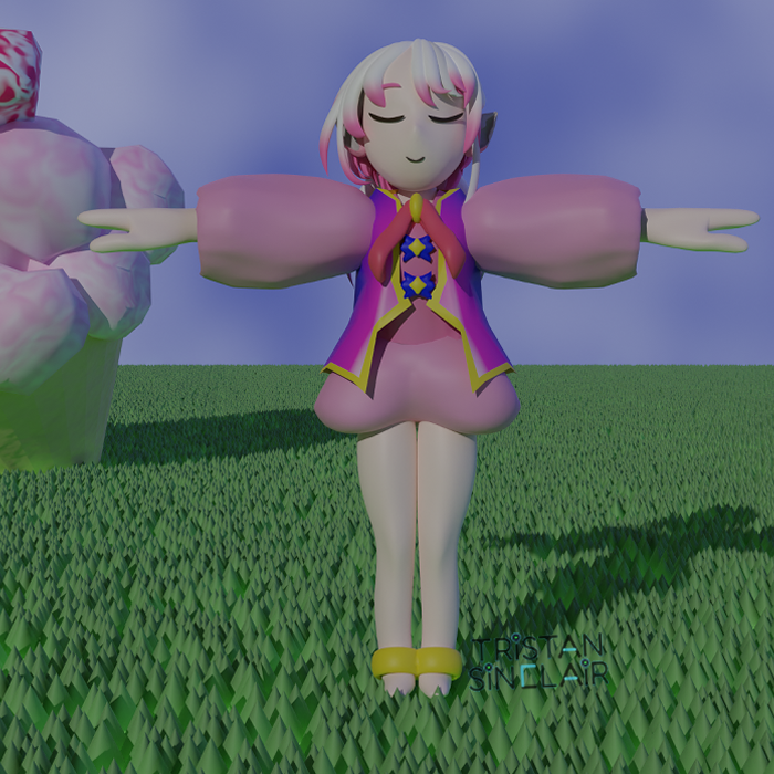
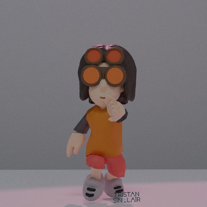
| 3D model of a character. Using 3D modeling to bring art to life, this character was imported as a image into blender and recreate the character as a 3d model. |  |
|---|
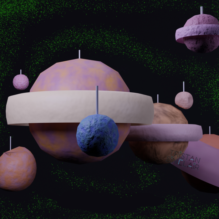
| 3D model of Planets attached to strings. This 3D model was made to be realistic crafted art, than image driven. to achieve the realistic visual, by making the planets have a rough surface and apply the visual of strings. This 3D model was made using a blender. |  |
|---|
| 3D model of a character running. In this 3D model instead of making a still model in blender, this one was animated using mixamo animation then import the animation into Adobe premiere to make a clip. | 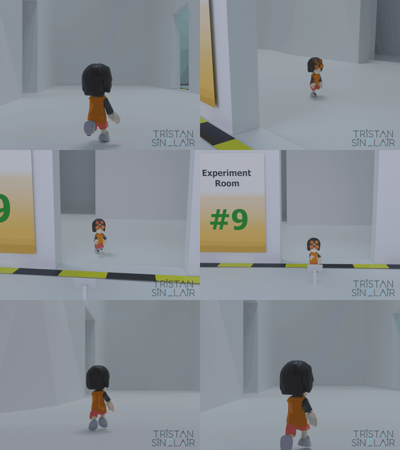 |
|---|